
Here is a roundup of the latest rends in the world of web design.
Our collection of trends are visual elements, skinny design blocks, a move to smaller logos and branding rather than the large center based logos that have been recently popular, and dark/moody design schemes.
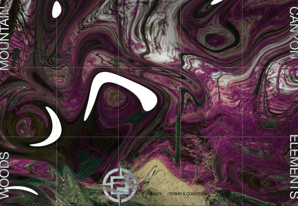
Skinny Vertical Elements
Skinny vertical elements that add a new visual wow to website projects. The space they occupy and the fact that they offer something different.
The only trouble can be with the move away from desktop to smaller screen resolutions. It’s also a technique that can be used for many different purposes.
Front Pourch Brewing uses a very skinny vertical bar with icons on the left of the screen to show their navigation. On a mobile device, the yellow bar collapses into the bottom area of the screen showing a hamburger menu.

Fila Explore again uses skinny vertical web navigation icons, but htis time on both sides of the screen. These change the image when hovered. Each word can also be clicked to navigate to another page. The UX (user experience) is the same on a mobile device.
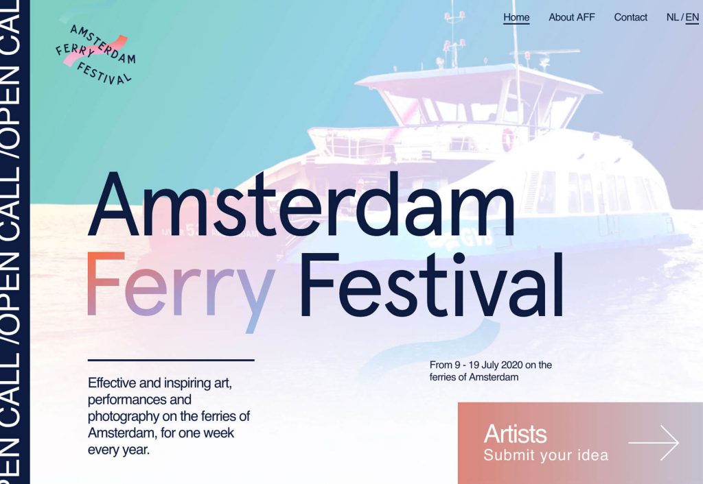
Amsterdam Ferry Festival uses a very skinny vertical element on the left side of the screen with scrolling text. This is also a clickable area and takes you to the “call for entries” page in the scrolling text. This is a different way to implement a scroller that isn’t at the top of the homepage. This is good placement because it doesn’t detract from the rest of the design. The placement and UX is similar on mobile.
Tiny Logos and Branding
It’s usually the best practice to insert your company logo at the top left corner of your web site. This isn’t a new idea and people are used to it. It’s also now widely assumed to be clickable to go back to the home page.
There is now a shift in trend for these logos and brand marks to get much much smaller.
This could be due to responsive design and how we are viewing on phones or small devices. Big logos simply take up much needed space on mobile devices.
Aside from large corporate companies that everyone knows, the brand is often second place to what’s being displayed.

Dark and Moody website themes
Moody website themes have a sleek, dark look that seems to instantly jump out. This trend really pops right now because light and white minimalism, or bold colours are very trendy and current.
It makes dark themes stand out even more.
Warped Cigars uses a black and white theme with bold fonts. Images lack color and also have a bit of a dark overlay to give more room to text elements.

Vandal uses a intriguing images in a very dark setting. Each looks like it was taken in a dark room. Images are enhanced with gold accents and lettering to give a very regal feel of quality.

Hype uses a traditional dark colour scheme with a slideshow of images with dark overlay for highlight text elements. Images are both colour and mono as the slider almost allows the dark, moody scheme to flip and draw you back in for another look. The image selections also contribute to the moody dark feel of the website.
